This is the time of year for healthy competition. The NFL Conference playoffs are completed and the Super Bowl is just around the corner, The Daytona 500 is coming up, and the Rumble in the Orchard is going strong! Design Teams for the various designers at Scrap Orchard are having fun and providing lots of inspiration. Stop by when you get a chance and vote for Krisi's team!
All this competition got me to thinking about hybrid crafting and the many options it opens up to a paper crafter. It's Cathy (Scrappycath) here with a look at two different ways to make a hybrid card using digital elements. I'm going to compare a "digital printable", and a "print, cut and assemble" card.
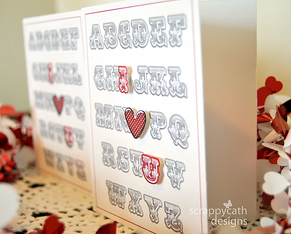
In the photo above, which card is a digital printable? Which one is print, cut, and assemble? Can't tell? A digital printable is a card that you design using your photo editing software completely and then just print it out. A print, cut, and assemble card is one that you design in your photo editing software, but print elements separately, cut them and build the card physically. Each way gives you a beautiful card. So, do you give up on which card is which? Keep reading....
I created the cards in Photoshop using the Wall Art: i {heart} u and ABC's template by Krisi's Kreations. I also used the alpha from the digital kit My History by WM Squared Designs. I recolored the I and the U with a digital paper from another digital kit, Je t'aime also by WM Squared Designs. The heart is from a digital kit called Rebel by Joyful Heart Designs. On one card design, I included the I, heart, and U with shadow. On the other card I printed those elements separately. I cut them out and adhered them to the card using foam dots.
Have you figured out which card is which?
The one on the right is the print, cut, and assemble. By this angle, you can see how I raised the I, heart, and U using the foam dots. This really gives the card dimension. If you are mailing your card, you may not want the added dimension. In that case, you can simulate the look of the raised elements by applying a deeper shadow to the elements in your software before printing them out.
There you have it. Two different ways to create the same beautiful hybrid card!


Awesome!! :)
ReplyDelete