Tuesday, January 31, 2012

{Project Life} Week 4

Pin It

The Mom Creative

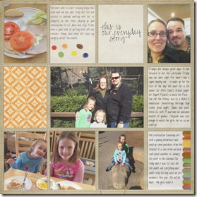
Wow. I completely spaced that today was Tuesday – or I guess even that yesterday was Monday! But I finished up my pages so I could share with you. Again … down below I have set up a linky so you can share your digital pages with me (and others).

jan_wk4a_webjan_wk4b_web

jan_wk4a_web

jan_wk4b_web

I used a kit available through The Daily Digi – called Everyday Life. It is a bonus kit you get when you are subscribed for a certain number of months. If you haven’t heard of The Daily Digi and you want to dabble in digital… go sign up NOW. Seriously the BEST deal in digital scrapbooking.

Took less pictures this week than in the previous weeks, we were to busy baking!  Ultimately that led to us eating WAY to much junk and sugar – something we are working on this week. – Wish us luck!  Back to eating healthy and using our Shelf Reliance THRIVE products!


linked with www.themomcreative.com and www.onehappymama.com

Pin It

Monday, January 30, 2012

{Monday Mix} Hybrid vs. Printable

Pin It

This is the time of year for healthy competition. The NFL Conference playoffs are completed and the Super Bowl is just around the corner, The Daytona 500 is coming up, and the Rumble in the Orchard is going strong! Design Teams for the various designers at Scrap Orchard are having fun and providing lots of inspiration. Stop by when you get a chance and vote for Krisi's team!

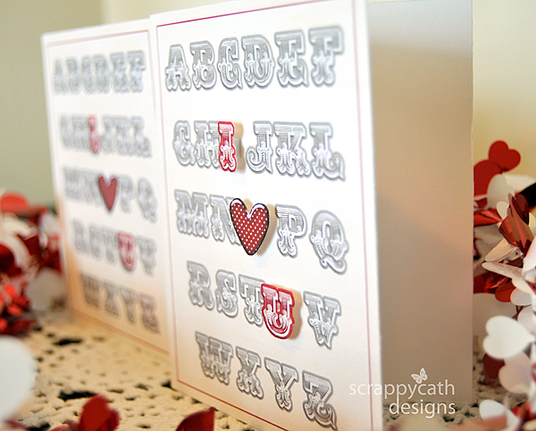
All this competition got me to thinking about hybrid crafting and the many options it opens up to a paper crafter. It's Cathy (Scrappycath) here with a look at two different ways to make a hybrid card using digital elements.  I'm going to compare a "digital printable", and a "print, cut and assemble" card.


In the photo above, which card is a digital printable? Which one is print, cut, and assemble?  Can't tell?  A digital printable is a card that you design using your photo editing software completely and then just print it out. A print, cut, and assemble card is one that you design in your photo editing software, but print elements separately, cut them and build the card physically.  Each way gives you a beautiful card.  So, do you give up on which card is which?  Keep reading....


I created the cards in Photoshop using the Wall Art: i {heart} u and ABC's template by Krisi's Kreations. I also used the alpha from the digital kit My History by WM Squared Designs. I recolored the I and the U with a digital paper from another digital kit, Je t'aime also by WM Squared Designs. The heart is from a digital kit called Rebel by Joyful Heart Designs.  On one card design, I included the I, heart, and U with shadow. On the other card I printed those elements separately. I cut them out and adhered them to the card using foam dots.

Have you figured out which card is which?


The one on the right is the print, cut, and assemble.  By this angle, you can see how I raised the I, heart, and U using the foam dots. This really gives the card dimension.  If you are mailing your card, you may not want the added dimension.  In that case, you can simulate the look of the raised elements by applying a deeper shadow to the elements in your software before printing them out.

There you have it. Two different ways to create the same beautiful hybrid card!

Pin It

Friday, January 27, 2012

{Friday Fun} Pillowbox Door Hanger

Pin It

Teresa here to show you a fun new product from Krisi and some of the fun things the CT girls have done with it. You can find it here.

Rebecca made this cute one. What a fun little suprise to leave for somebody.

These next 2 are by Sharon (quietanglesb). I really like how she used it to hold seeds and the cute saying.

This next one is such a great idea. Everybody loves a little TLC when they are sick.


As I am looking at all of there great ideas I am thinking of the fun things that could be done with this template. I am thinking of leaving a little suprise on the door for my daughter on Valentines day (like Mel did - see below). Or what a fun way to leave some treats for your neighbors at any holiday.


And here is a look at the template:

Hope you enjoyed all of the fun goodies. Oh and grab it before Sunday night to save 20%.

Pin It

Thursday, January 26, 2012

{Tutorial Thursday} Pillow Door Hanger and Accordion Flowers!

Pin It

Hello, there! LeAnn, here.
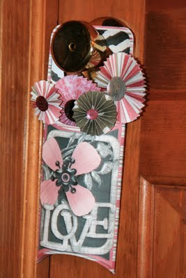
Today is a tutorial on using a couple of Krisi's products together:

Accordion Flowers:


and the Pillow Door Hanger:


For this project I used the "She's All That" kit from Jady Day Studio.
Her designs can also be found at Scrap Orchard.


After I clipped the papers to Krisi's template and printed, here's what I had gathered:


Next, I scored the fold lines with my bone scoring tool. Then, I cut out the pieces and folded along the score lines. I accordion folded the strips for the flowers and glued the strips together for the larger flowers. For a detailed tutorial on assembling the accordion flowers see this post HERE.


Then I glued the piece called the "back" to the inside of the hanger.


Next I folded the pillow over and glued the flap closed, as well as folding up the bottom and gluing that. The hanger part is now done!

Next up, finishing the flowers. First I glued the ends of the accordion strips together to form a circle. After they dry, I like to cut circles out of scrap paper and use hot glue to hold the flattened-out flowers together. No one will see the backside, anyway, right? :)


After gluing some buttons in the center front of the flowers and paper strips to the back, I arranged them in the pocket of the door hanger. Its a pocket full of posies!

You could get creative with what you use for the center.
How about candies? (You might even find a way to have them remain edible!) You could also attach pipe-cleaners to make stems, or even rolled paper. Get creative!

My favorite configuration, however, was when I used one of the smallest flowers as the center of the flower on the pocket, and filled the pocket with kisses! Yum! :)
Lots of ways to create, and you don't even have to end with what you started out to create! :)


Hope you enjoy working with these products!
LeAnn

Pin It

Wednesday, January 25, 2012

{Wacky Wednesday} Softening Your Camera's Built-In Flash

Pin It


Happy Wednesday, friends! Sarah (sporte91) here to show you a quick tip for using your camera's built in flash.

I happen to own a Canon 580ex to pair with my DSLR. But sometimes I don't feel like lugging that big thing around, or a moment is happening too quickly to pop it on, or I don't have batteries charged for it. So what do I do if it's dark and I need to use flash? I use the one built into my camera. But not all by itself. Using your camera's built-in flash can give a harsh, cool look to your photos that's unnatural and not at all flattering.

Here's a shot I grabbed of my goofy son, using my built-in flash:


Can you see how his skin looks really pale and the shadows are harsh? Not so good. But I can fix that with a really simple tool.


This is a piece of computer printer paper, rolled into a tube. When I sit this over my camera's flash, it makes the light bigger and softer.

Here's a photo with my paper tube over the flash:


Can you see the difference? The shadows are softer, and the color of his skin is warmer and more natural.

Try this for yourself. Experiment by folding your paper into different shapes and see how it changes the look of your photos.

Would love to see photos and layouts of you using this technique. Link them up in the comments so we can leave you some extra love.

Happy snapping!

Pin It

Tuesday, January 24, 2012

{Project Life} Week 3

Pin It

We had a busy week this week, with lots of picture taking.  Although I still missed a day of taking a picture – Tuesday at the baby shower. I sent an e-mail out to someone who got a group shot to see if she could e-mail it to me. I will stick it in there if she does. If not I will just modify that space.

I was listening to The Digi Show and they were talking about projects and releasing some of the burdens that many place on them doing “projects”. This is the first time I have gotten this far on a project. I wanted to do P52 last year and I couldn’t even decide when the week went (Sunday to Saturday or Saturday to Friday – since the first was a Saturday last year). So I am doing great this year!

I must say I am loving this method of scrapping as I feel like our LIFE is actually being scrapped, it is great.

Here are my two pages – for week 3.

jan_wk3a_web jan_wk3b_web

jan_wk3a_web

jan_wk3b_web

I used supplies from Chelle’s Creations – What a Hoot and Gina Miller’s Journaling Cards. Images are linked to my gallery at Scrap Orchard.  I did do a little modification to the colors of the word art so it matched the other colors better – I loosely used this tutorial here.  The day of the week labels I made myself – I will try to package them up for you for next week – for anyone who would like them.

You can follow my Project Life pages on Pinterest also.

Now… off to finish my release for this week!

Are you doing Project Life – Digital?

I would love to have anyone who is creating digital pages link up here – While I love checking out the paper pages I would love even more to see more digital pages each week. So… link them up.

Pin It

Monday, January 23, 2012

{Monday Mix} Hybrid Home

Pin It

Hi, everyone! It's Rebecca (reboscraps) here with a quick and easy tutorial for you. When I saw the Plan It: Menus in Krisi's shop, I knew it was the perfect thing to cute up the fridge. I've often made lists of what's for dinner, but always on scraps of paper here and there. I used her Menus template and cute digi scrap supplies to make a permanent fridge list that I can reuse again and again.

I started with these two products from the Scrap Orchard Market, first of course is, Krisi's Plan It: Menus


and I added papers from the Family Reunion Collab by Jady Day Studio and Suzy Q Scraps


I liked the vertical template best, so I designed my project, and printed it out:


I'm going to show you how I laminated mine, but if you don't have a laminator you could simply slide this into a standard letter-size page protector and trim the side with the holes. This would be a super quick and easy way to make your menu reusable, and it would look something like this:


You might notice that because of the printer margins, I ended up with some white borders on my printout. I decided I would trim those off:


Another option would be to layer your scrapped print with a solid sheet of paper if you prefer a bordered look, like this:


The layered look would probably work great if you use a page protector, but I wasn't sure the thickness of the paper would work in my laminator, as I haven't done a lot of experimenting with it yet. I decided to skip the extra sheet of paper, and I actually like that my project will have a little extra lamination around the edges, I think it will give it some added durability. Here's my project ready go through the laminator:


A quick trip through the laminator:


After it was stuck together, I added some peel and stick magnets to the back, and the project was ready to look cute on the fridge!


Now, I just have to plan some menus!

Linked up to:

Pin It

Saturday, January 21, 2012

Thursday, January 19, 2012

{Friday Fun} Cards, Flowers & Wall Art

Pin It

The girls on my team had fun creating this week!   Four of the girls are participating in the Rumble in the Orchard challenge. Here is their finished project:

Rumble-1-Comp

Cards that have a rainbow effect to them – each girl created a different card (and they are spread across the US and one in China!). They did great – head over and vote for them HERE (Krisi’s Kreators).

And some other projects they did:

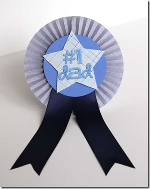
Badges were a fun thing with the accordion flowers!

LeAnn:
accordion_leann

Tamara:
accordion_tamara

Sarah:
accordion_sarah

But they are great for cards too:

Rebecca:
accordion_rebecca

And… some wall art.

Jen:
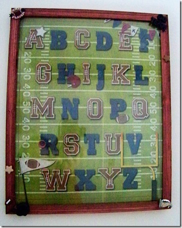
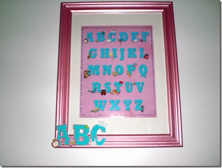
abc_jen

Tamara – who did a girl and a boy version.
abc_tamaraabc_tamara_girl

Jennifer (who shrunk the wall art down and made it into a card):
abc_jennifer

Here are the products that they played with this week:


Are you considering going to DigiScrapApalooza? I know I am headed to Vegas in March. Come join me!  Use this code to save $20 – KRISISENTME   If you have questions… just send me an email.

Pin It