Hi, there! Rebecca here today, one of Krisi's CT members. You can find me in scrap forums and galleries under the name "ReboScraps."
Today, I'm going to share one of my newest projects, and how I used digi design tips when I was creating my project. A couple weeks ago, Liz (mommy22girls) posted tips about color proportions for the ScrapMatters Saturday Special Challenge. The concept is that when choosing colors for your page or project, you use proportions similar to gallons, pints and quarts. The "gallon" will be your primary color, the "quart" is your secondary color, using it about 1/4 (ish) of the amount of your gallon color, and then the "pint" is just touches of a third color.
I used this technique when creating a card. Since the front of a greeting card is basically a 1-dimensional canvas like a scrap page, concepts like this are easy to apply to hybrid projects, and I think a color concept like this would also be helpful for a 3-dimensional project like a box.
So here's my card, which you may have seen in Friday's new release post. My "gallon" is the (mostly) white background, my "quart" is the grey, and my "pints" are the yellow and orange. I like to "scrap" my hybrid pictures in to layouts, so just look at the photo of the card, because I didn't necessarily follow the rules for the page!
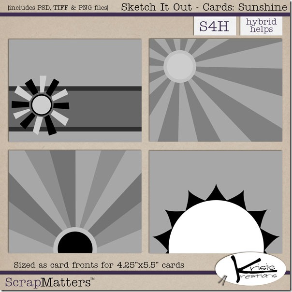
This card is made with the Sketch It Out - Cards: Sunshine templates and Write it out: Sunshine word art, both of which are included in Krisi's 2011 NSD Hybrid Grab Bag until today! (Starting Thursday, they will be available separately in her ScrapMatters shop.
Thanks for stopping by the blog today!


No comments:
Post a Comment